
My Little Peony
Promotional Campaign – Visual Identity
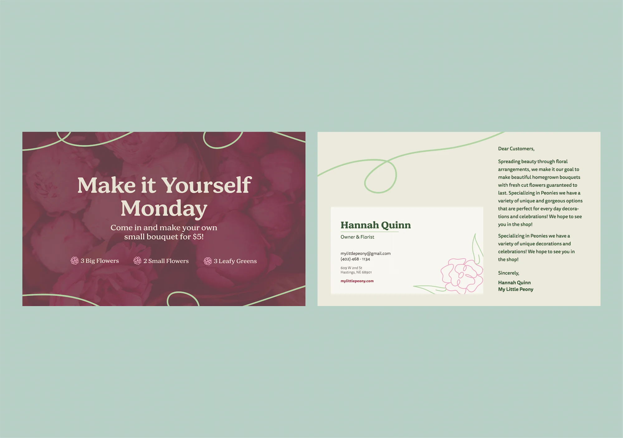
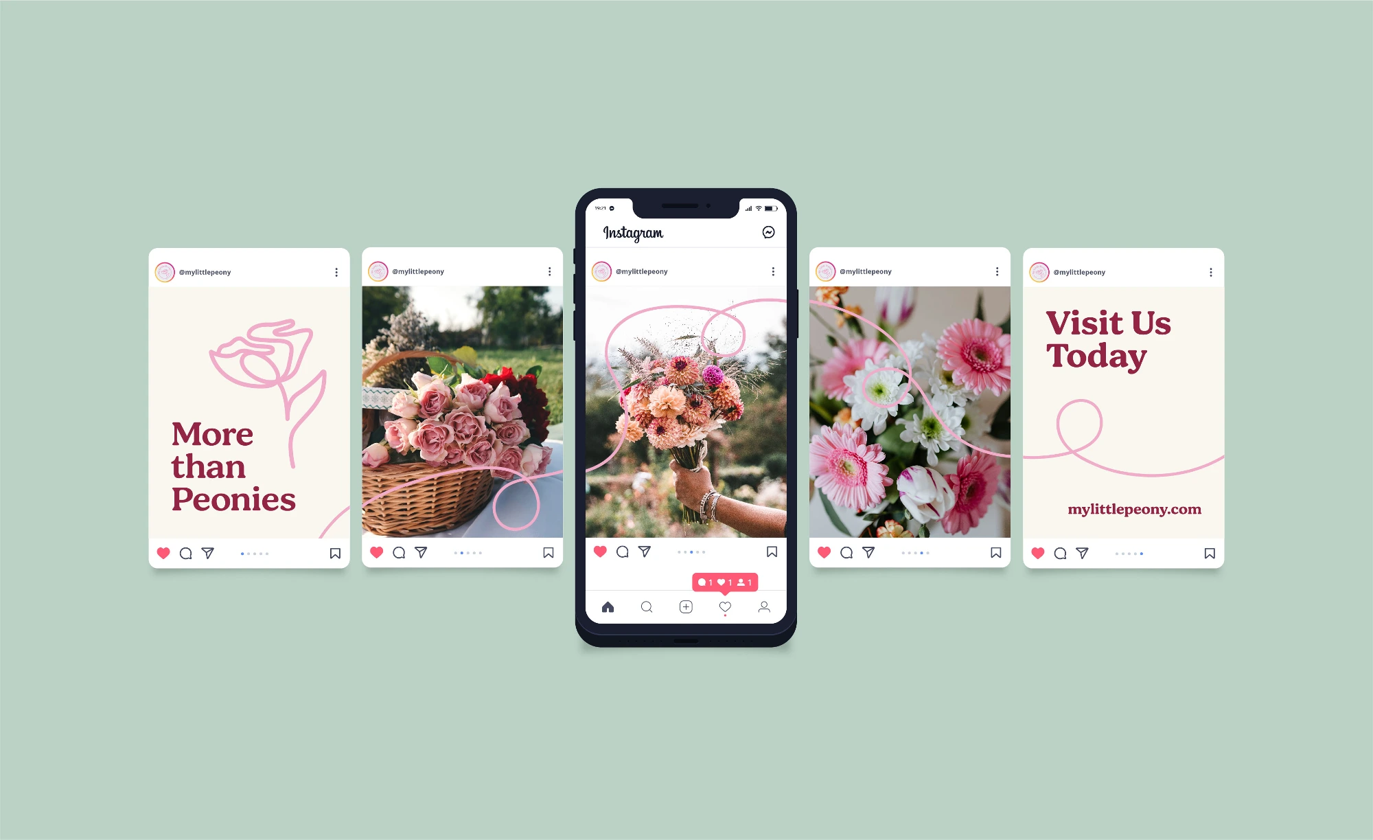
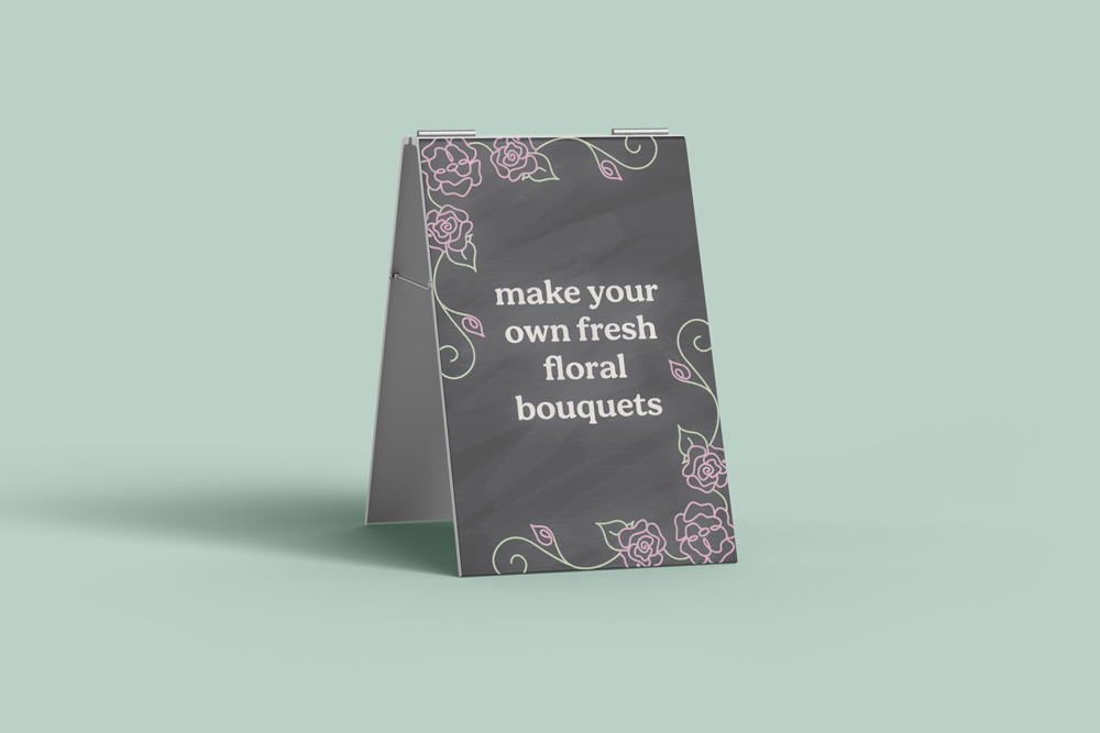
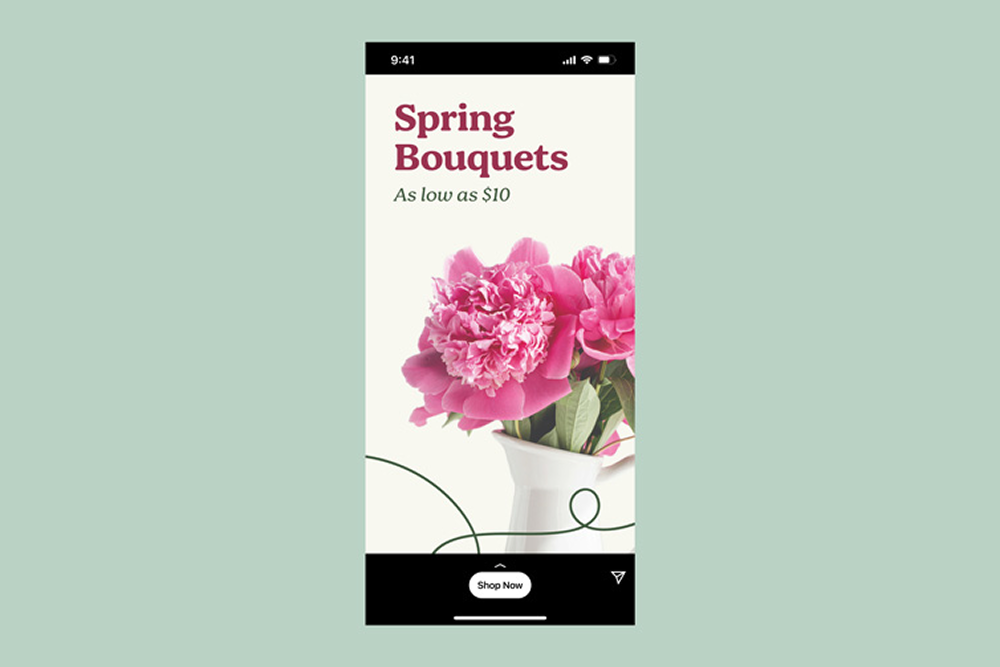
My Little Peony is a new local floral shop in Hastings, Nebraska, whose mission is to spread beauty through floral arrangements by specializing in peonies and making bouquets. They pride themselves on providing beautiful homegrown floral arrangements with big fresh flowers guaranteed to last. As a new shop, they not only need a visual identity system but promotional materials to introduce themselves to their community.

The Solution
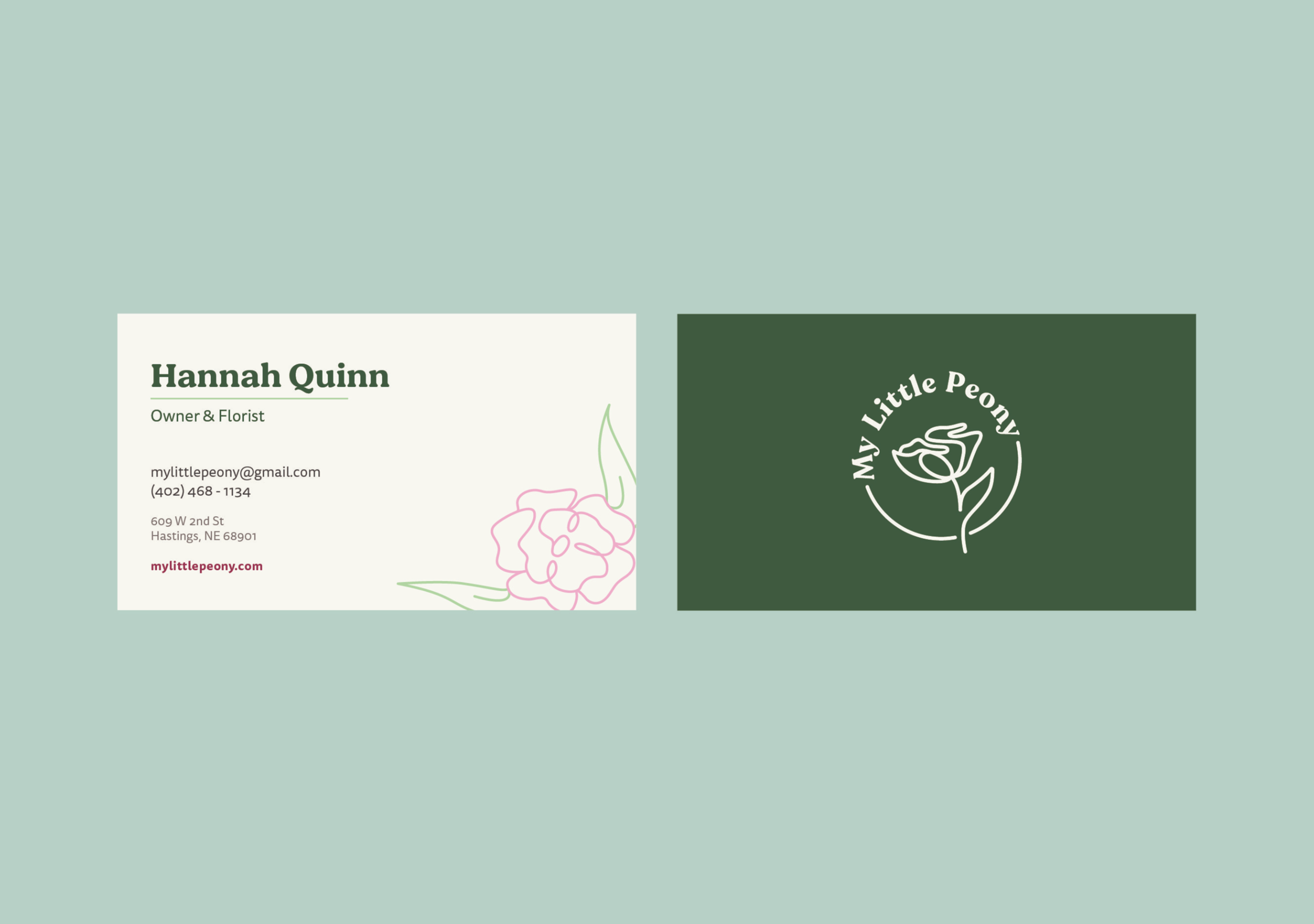
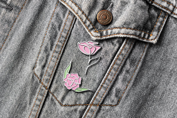
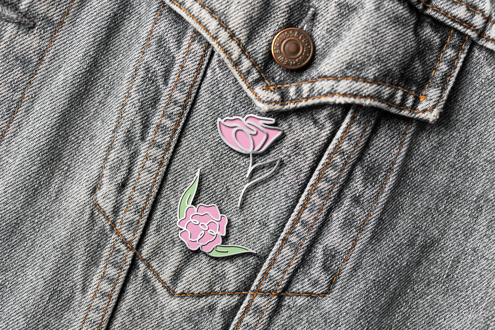
My Little Peony works with flowers and interacts with their customers, building relationships with them. They want to be seen as relaxing and joyful, so I utilized natural and soft colors and a playful continuous line throughout the design. In the logo, I used a continuous line to make the flower. This helps it feel joyful and replicates the ribbons that would tie the bouquets together. It is delicate, giving the feeling of joy and expertise. It is also lighthearted portraying My Little Peony’s relationships with their clients and the work that they do with the flowers. The typeface for the headlines is a bubbly slab serif that shows the personality of the shop, and the body copy is a humanist sans helping the design feel welcoming and friendly.